The stock market is a lot like Texas Hold’em: You’re dealt a hand and it’s up to you to decide your bet.
Once in a blue moon, you land the best hand possible… pocket aces.
In Hold’em poker, if you’re dealt two aces, you’ve an 81% chance of winning a heads-up match.
Naturally, there’s a 19% chance of losing with this hand—but, the odds say to bet big.
That’s why I ignore the news headlines. I only look at data for an edge. And last month, the market dealt us pocket aces…
Mapsignals’ Big Money Index (BMI) measures big buying (think large hedge funds) against selling. When the BMI is above 80%, it means the buying can’t last.
Below 25% means the selling can’t last and the market is oversold. When this happens, it’s like the market is dealing pocket aces.
The chart below shows what pocket aces look like on the BMI… the green area is oversold.
And it’s my biggest buy signal by far.
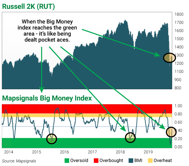
The BMI went oversold on March 19. Since then, stock market returns have been big, as you can see by the three indices below:
- iShares Russell 2000 ETF (IWM): +17.96%
- SPDR S&P 500 ETF Trust (SPY): +19.91%
- Invesco QQQ Trust (QQQ): +21.44%
Peak fear is behind us
Since I left Wall Street and co-founded Mapsignals, I’ve been collecting stock data like an addict.
Analyzing it for years helped me realize there are phases of big money.
I showed you this chart on March 30:
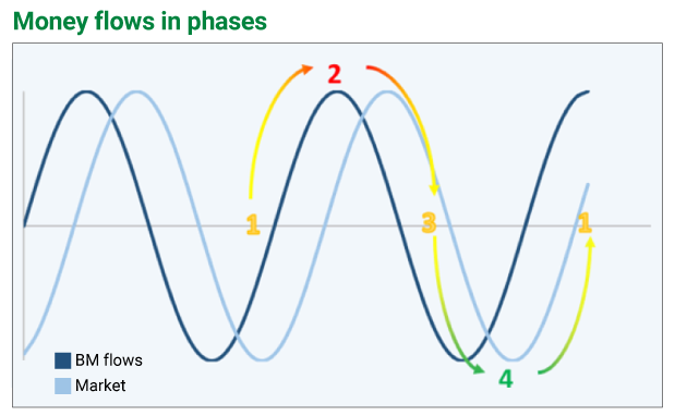
It’s an inside look at how I interpret my data.
These are the phases of big money flows:
Phase 1: Liftoff—Big money buying is huge and selling is nearly zero.
Phase 2: Market peaks—Big money buying slows and selling picks up.
Phase 3: Fear begins—Big money buying slows more and selling takes off.
Phase 4: Peak fear—Big money buying is non-existent and sellers are in control.
The second half of March found us at the trough—the bottom of phase 4.
Since then, we’ve shot up from 4 closer to 1, but massive stock selling must slow to reach Phase 1.
Let me show you what I mean…
Let’s pop the hood on the market
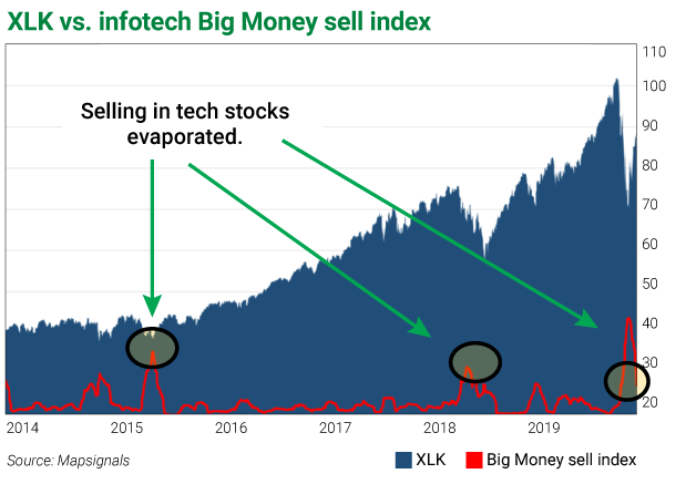
Two weeks ago, I showed you sector charts highlighting big selling.
These are some of my favorite charts because of the way the data indicates slowing selling.
Remember, before Phase 1 (big buying in stocks) can start, selling has to decline.
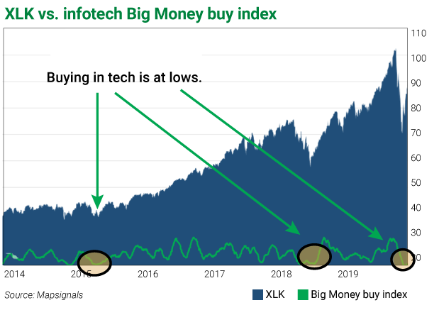
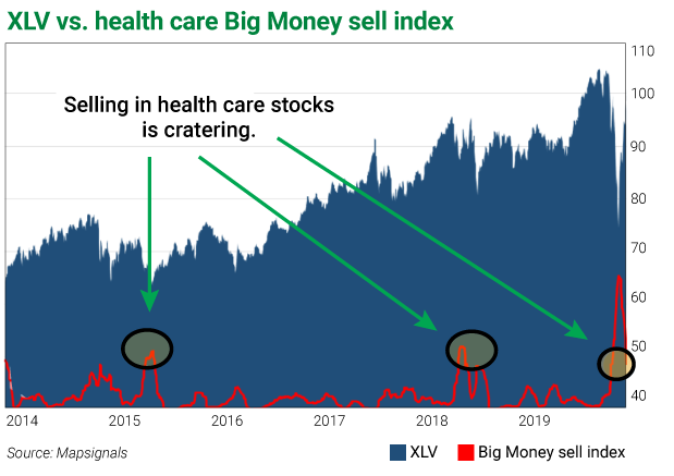
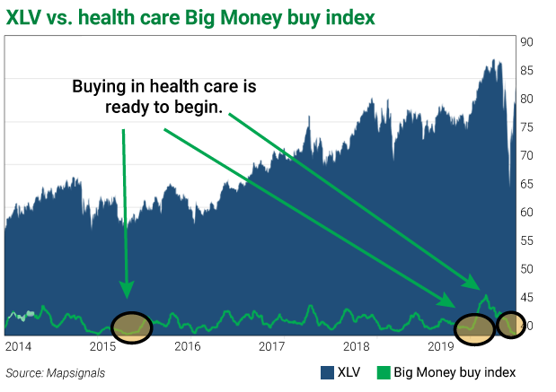
Let’s look at tech, healthcare, and industrials as examples.
The charts on the left have a red line showing sector selling. If this line is rising, selling is picking up. If falling, selling is slowing.
The charts on the right have a green line showing sector buying. If it’s rising, buying is rising. If falling, buying is falling.
Here’s technology:
Now healthcare:
Lastly, industrials:
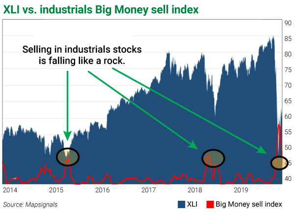
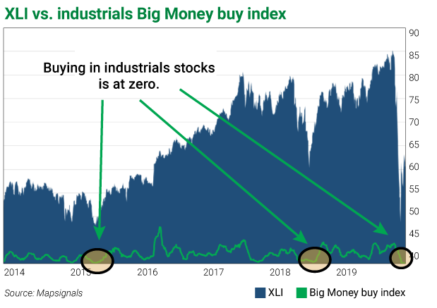
Look how selling dropped in a straight line… then notice how buying is at zero.
When buying is at zero after monster selling, there’s only one way for it to go—up.
And right now, selling is giving way to buying.
Bottom line: The worst is behind us.
I’ve been saying this for weeks…
Still, many people are surprised at how quickly the market rebounded.
But when markets get oversold, that’s exactly what I expect: extreme selling followed by a major bounce.
Looking at the headlines, it’s tough to see that. But looking at the data makes it crystal clear.
Emotion is great when it comes to family and friends. When it comes to investing, I go by the numbers.
When markets are at their lows, so are most emotions. But the data tells us that there is opportunity.
Here’s a thought that sums it up:
When the world sees prosperity, it’s hard to imagine a crisis.
When the world sees a crisis, it’s hard to imagine prosperity…
P.S. There’s an easy way to take advantage of this enormous buying opportunity…
In this month’s issue of Curzio Research Advisory—my colleague Frank Curzio recommended FIVE STOCKS best-positioned to weather the COVID storm… and soar as the market rebounds.
In the coming months, Frank will be recommending more of these names. And right now, you can try Curzio Research Advisory for a ridiculously low $49—RISK FREE.


